
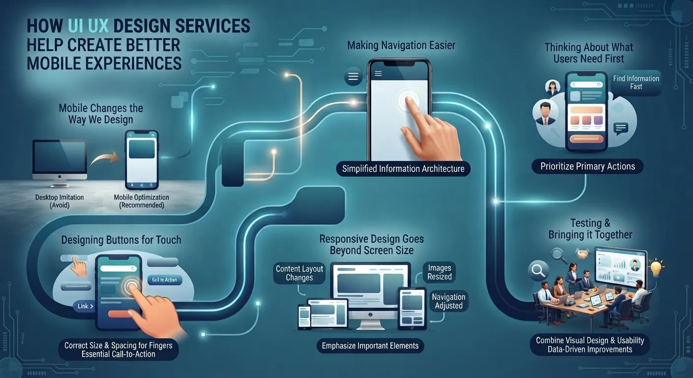
A significant amount of everyday browsing is now done on cellphones, so a site must be functional well past a desktop screen. Small text on buttons and menus, awkward arrangement, pages that do not adjust themselves according to the display, and other similar issues can frustrate the mobile user almost immediately. The ui ux design services can assist in this area as well, addressing the way people view, navigate, and interact with digital products in general.
Why Mobile Changes the Way We Design
Unlike the desktop version, a mobile device’s screen is much smaller. Therefore, the same amount of information cannot be placed on a small screen as on a computer’s one. This is why mobile design should not imitate the desktop version but be optimized to look attractive and be easy to use. It also needs to have a specific structure and organize information in a way that would suit both tasks: the user’s and the designer’s purposes.
Making Navigation Easier on Smaller Screens
Navigation can turn out to be one of the most challenging aspects of a mobile device. The menu that looked perfect on a big screen can appear too tiny on a smaller phone screen.
Mobile navigation needs to be created in a way that the most used sections are easy to reach without having to use a quarter of the screen or multiple taps. Using intuitive titles and recognizable patterns will aid users in their discovery of the application.
Keeping Menus Simple
A mobile menu is not required to show all options at once. It is important to group related pages and arrange them so that the menu is logically easy to navigate.
The same goes for any interface. Too many competing options may cause the user to spend more time choosing what they want than actually using the app.
Designing Buttons for Touch Interaction
A person uses a mobile device with their fingers, not a pointer, which is why the size and spacing of clickable elements are much more important.
The buttons should be placed in such a way that they can be pressed without effort, and other interactive UI elements such as links and controls should be spaced out enough not to be mistaken for each other.
Responsive Design Goes Beyond Screen Size
Responsive web design makes webpages adapt to different devices and screen sizes. However, simply changing the page’s width is not sufficient.
The content’s layout has to be changed, images resized, and the navigation adjusted depending on the resolution- so that the interface is easy to use on both desktops and mobile devices.
Thinking About What Users Need First
Users who visit the site using a mobile device have the primary purpose of seeking a specific piece of information or performing a particular action. The homepage should not distract them from achieving their goal.
The analysis of the target audience and the identification of the website’s purpose can aid in eliminating irrelevant information and emphasizing the most important elements so that they appear prominently on the page and can be found quickly.
Wireframes Can Help Plan the Mobile Experience
Before building the final interface, we can utilize wireframes to help us visualize how the content and interactive elements will be placed on a smaller, more compact interface.
This step allows designers to conceptualize and experiment with the pages and their hierarchy, navigation, buttons, forms, and other elements in relation to each other in a much faster and easier manner, without getting caught up in the details of the interface itself.
Planning Different Screen States
A mobile interface could potentially take different forms on different screen sizes or interactions. A menu could be opened one way on one screen and another way on a different screen, content blocks could move to different positions on the screen, or some elements may need to "stack" on top of each other vertically.
Thinking through these scenarios ahead of time can save issues down the road in the design process.
Testing the Experience With Real Users
A designer cannot always tell what to change when looking at one of their own designs. A person unfamiliar with the system could look at the same interface and have a reaction completely different from what the creator intended.
Through a usability test, feedback on certain aspects of the interface could be received that would otherwise not be thought of. Through these tests, changes can be suggested and accepted to improve the design.
Bringing Visual Design and Usability Together
A mobile interface still needs to look appropriate to the product and its audience. Colors, typography, imagery, spacing, and other elements contribute to the interface feel.
At the same time, appearance should not compromise important actions' discoverability and usability. ui ux design services can bring together the visual design and usability to achieve an interface that is appropriate to the product and practical for the people who are using it.
Creating a Smoother Mobile Journey
A good mobile experience often comes down to removing small obstacles. Clear navigation, readable content, sensible spacing, responsive layouts, and easy-to-use controls can all make a difference.
It can include responsive web design, mobile app UI/UX, wireframing, usability testing, and user feedback as part of the design process. Looking at these elements together can help create mobile experiences that feel more natural from one screen to the next.
Designing Around Real-World Use
People use their phones in many different situations, often with limited time or attention. A digital experience that keeps its structure clear and its interactions straightforward can make it easier for users to complete what they came to do.
The strongest mobile interfaces are not necessarily the ones with the most features. They are the ones that make the important actions understandable while keeping the overall experience comfortable to use.









Responses (0)